Brand first
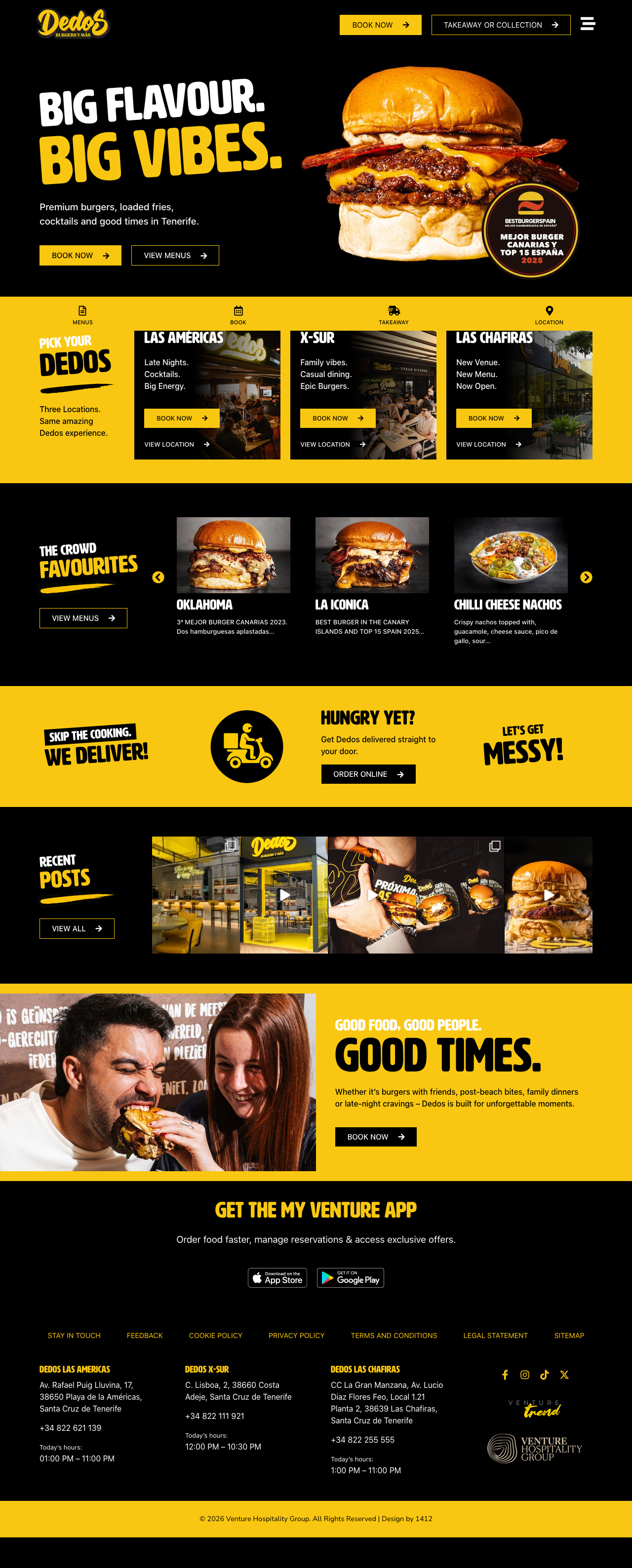
Black, yellow, oversized type and burger-led imagery keep the digital experience connected to the physical brand.

Hospitality · Restaurants · Case study
Bold enough to match the brand. Simple enough to get people booked.
Dedos already had a loud, recognisable personality. The digital job was not to tone that down — it was to turn the same energy into a clear multi-location customer journey.

The brief
Dedos is intentionally bold: black, yellow, oversized typography, strong food photography and a sense of fun. The website needed to feel unmistakably Dedos without allowing the visual personality to get in the way of booking, ordering or choosing the right venue.
With multiple locations, the bigger UX challenge was context. A customer choosing Las Américas should not accidentally end up with an XSur reservation or ordering journey. The site had to remember the venue choice and make the next action feel obvious.
Design direction
The visual system uses the existing Dedos personality as a strength, then creates enough hierarchy around it that the commercial actions remain easy to find.
Black, yellow, oversized type and burger-led imagery keep the digital experience connected to the physical brand.
Reserve, order and location actions are treated as core parts of the experience rather than footer utilities.
Venue choice influences the journeys that follow so customers are less likely to land in the wrong booking or ordering flow.
Development & UX
The interesting part of the build sits underneath the visual layer: the website needs to react to the customer’s selected venue and direct reservation and ordering actions accordingly.
A flexible editing environment for ongoing content while retaining custom behaviour where the experience needs it.
JavaScript handles selected-venue state and updates the relevant calls to action around the site.
Venue-specific reservation triggers keep the booking route aligned with the selected restaurant.
Takeaway and ordering actions change with location rather than relying on one generic link.
The same location-aware behaviour is maintained across English and Spanish journeys.
Important restaurant actions remain close to the customer on smaller screens where much of the journey happens.
What changed
The finished experience keeps the energy of the Dedos brand while giving the multi-location operation a clearer digital structure. The design looks intentionally loud; the functional logic underneath it is deliberately quiet.
The contrast
Dedos is intentionally loud, playful and immediate. Kensei needed almost the opposite: restraint, atmosphere and space. That difference is the point.
View Kensei Tenerife case study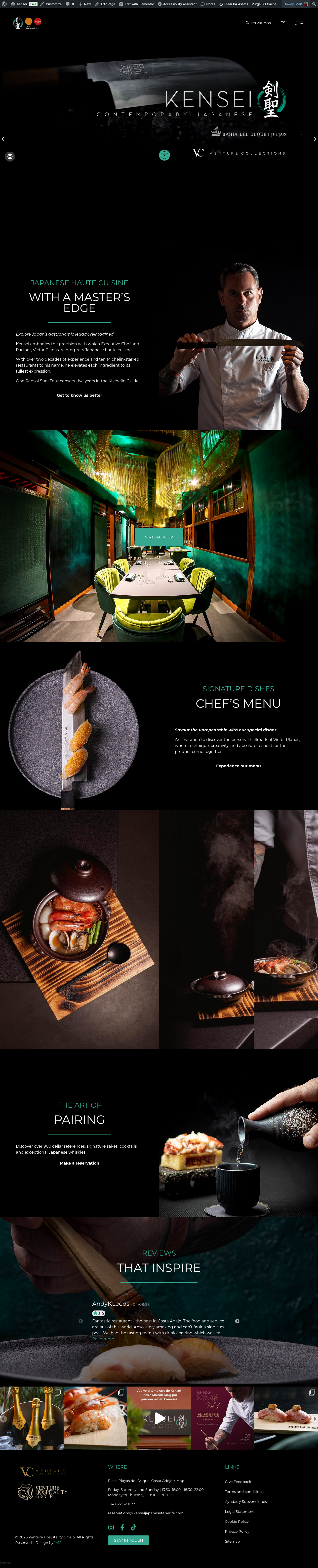
Selected work
The screenshots here are the real live-site designs rather than recreated portfolio artwork. Explore the site itself or head back to the wider 1412 portfolio.
Web Design
Tell us what you are building, replacing or trying to improve. Your enquiry type is already selected below so you do not need to enter it twice.